From the Designer’s Desk: Daphne Geismar
September’s edition of From the Designer’s Desk brings us wise and enchanting words from the estimable Daphne Geismar, a book and website designer with her own firm.
Why did you pursue design, rather than, say, painting or architecture or sculpture?
I’m interested in people and their stories. As a designer, I help people turn their words and pictures into an effective narrative. I’m also interested in typefaces that hold anecdotes and histories of their own. I make books with artists, authors and curators; I developed a photography and writing program for teenage mothers who told their stories and then presented them to peers, teachers and social workers; I teach an undergraduate book design class, with a focus on connecting literary and visual narratives; and I am working on a book of my family members’ chronicles and writings from the Holocaust. What I love about good design is that it clarifies, informs, and educates, allowing people to share their ideas and experiences with others.
Is your work on a book project usually more of a slow, progressive effort, or is it moved forward by unpredictable moments of inspiration?
Starting with a blank piece of paper is hard. Every time. Even though I am always working with words and pictures, developing a book for specific words and pictures is always new and unique. Jonathan Safran Foer writes in his introduction to The Diary of Petr Ginz, 1941–1942, “Giving a word to a thing is to give it life.” When I work with my colleagues on a book, that’s what I feel we’re doing. My process starts by summarizing everything I know about the project, making lists with ideas, figuring out the best trim size, selecting a typeface (often spending a day looking, and thinking about which will be a good fit), and creating a grid. Then, I begin to apply the content to the structure that I’ve developed. A system may work for one section of a book, but not another. The various parts have to develop simultaneously to see if the system works and to establish constants and variables. Along the way I make decisions about color, paper, binding materials and I continuously check that the word, image and page count are going to work. It’s important that there is time in the schedule to put the designs away. When I’ve left or when I return is when the moments of inspiration arrive.
Do you feel that a book’s design can, or even should, play an assertive role in how a reader experiences the book, or do you feel the best book design is a kind of behind-the-scenes art – where the reader isn’t even always aware of the influence of the design?
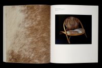
Paul Rand used to say that a design should be simple but not simplistic. This is what I think an art book should aspire to. The design should present the art and writing in an accessible way without unnecessary embellishments. The book should offer an intimate and engaging experience, encouraging the reader to interact with the object. If it has a cover that attracts, surprises and clearly represents the subject matter, it will draw a suitable audience. If it is the right size, with quality paper and binding materials, the viewer will want to pick it up, engage, discover, flip, linger. If the content is approachable through the organization, sequence and rhythm it will guide the reader. If the typography is refined, and if it is beautifully printed, the viewer will see and experience the art. The design of an art book should be simple, but the execution of great design is not.
What is your favorite font?
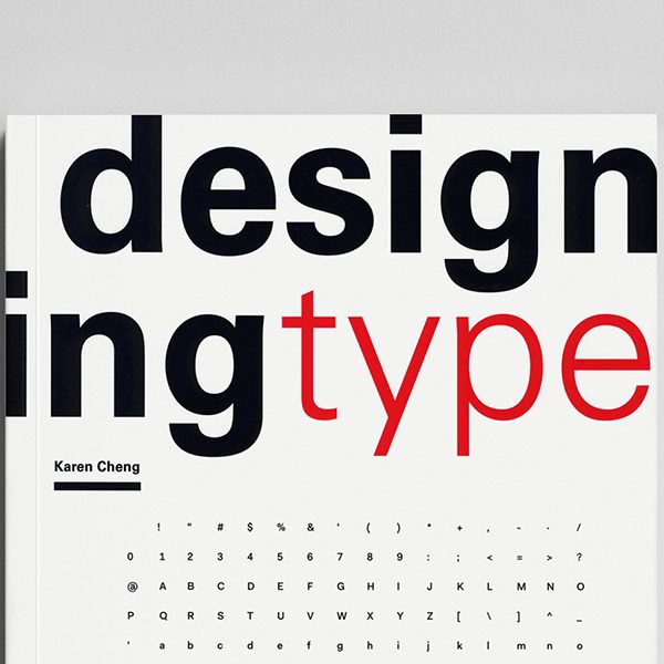
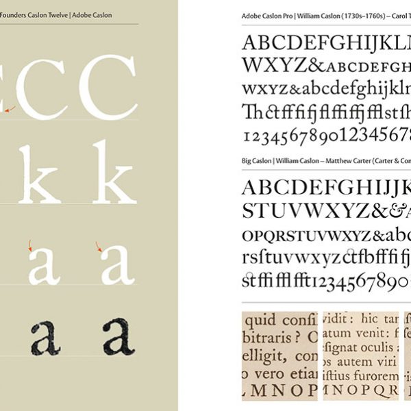
My favorite font is Frutiger, designed in 1975 by Adrian Frutiger. Adrian Frutiger refined and expanded Frutiger for digital typesetting, and Linotype released this enhanced version as Frutiger Next in 1997. Frutiger Next makes it possible to use Frutiger for book design. Frutiger contains the essence of Univers (1954-57), which was my favorite typeface when I was first studying design. Both are modern sans-serif fonts, which I favor for their simplicity, but Frutiger’s forms are more elegant and its proportions more beautiful. Frutiger is not strictly geometric; there is a slight variation to the strokes, making it a humanist face that is inviting and legible in lengthy texts. Frutiger Next includes a true italic, multiple weights, small caps, old style figures and other features that make it ideal for complex books with multiple levels of hierarchy. My favorite feature is the small cap figures that align with the x-height of the lower case letters. Frutiger does not call attention to itself. Sometimes I think I could use this typeface for every book I design.
How can an author make a book designer’s job easier?
My suggestions for making a book designer’s job easier also makes the end result better. Bring the designer in early to brainstorm structural and visual ideas; these early conversations can infuse and shape the project. Partner with an experienced designer whose work you respect and who is interested in your project; pass on as much knowledge and information about the project as possible; trust the designer to do justice to the content. Allow the designer to communicate and work directly with the artist, curator or author whose story she is facilitating. Stick to your deadlines, respecting that the designer needs enough time to create a beautiful and successful book. Encourage constructive collaboration where everyone does what they do best; avoid design by committee.
Who inspires you?
I am inspired by the teaching and writings of Paul Rand, Jan Tschichold, Jonathan Safran Foer, Elliot Eisner, Anni and Josef Albers, and Sōetsu Yanagi whose words include, “between use and beauty there is a close relation.” I also try to aspire to this famous quote by William Strunk, Jr., transforming it, in my mind, to apply to design: “A sentence should contain no unnecessary words, a paragraph no unnecessary sentences, for the reason that a drawing should have no unnecessary lines and a machine no unnecessary parts. This requires not that the writer make all his sentences short, or that he avoid detail and treat his subjects only in outline, but that every word tell.”
