From the Designer’s Desk: Barbara E. Williams
We are thrilled to share the April 2015 edition of From the Designer’s Desk: a beautiful reflection by Barbara E. Williams on 40 years in the business of book design. Barbara started her work in scholarly publishing at Duke University Press. She then served as production manager for a start-up trade publisher of travel and outdoor books, Menasha Ridge Press. Her studio, BW&A Books, founded in 1988, is now under the new ownership of long-time colleagues Julie Allred and Chris Crochetière.
Book Design in the Mirror, or Is that Screen a Window?
Sometime last year, it dawned on me that I’d been connected to scholarly book-making for 40 years; that realization helped nudge me into retirement. It’s not that I’ve learned everything there is to know about book design and production: this work remains engaging in part because it’s never possible to know it all. Each time we devise a way of navigating a challenge with a specific set of tools, either the challenge changes or the tools become obsolete.
Since the learning process is continuous, I found it to be a self-renewing and an ongoing evolution. Even while devising custom solutions for each manuscript, designers certainly build on skills and solutions that worked for past projects. Just how much of a continuum is this? How has the work of crafting handsome books changed during my working life? What endures? As I’ve looked back over a career that started with buying hot-metal composition and letterpress printing, I’ve begun to detect threads that, for me, trace a path to our 2015 encounters with pixels. Here are two.
Physicality.
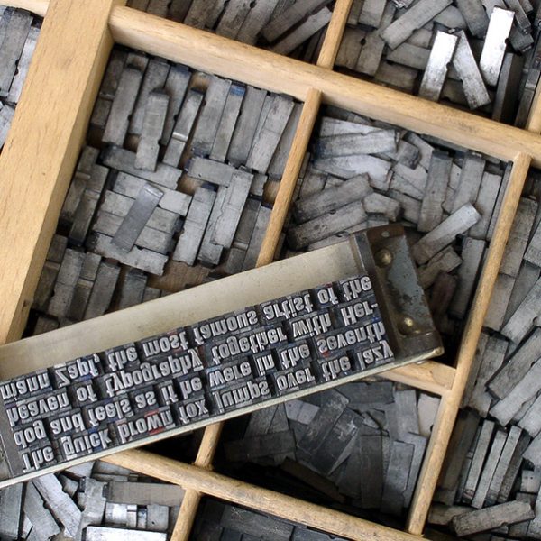
One obvious change is the nature of physical connection to the materials of our work. Nostalgia is seductive, and it can be fun to reminisce about how quaint we were when our tools included tracin g paper and type specimen books.* But, when we used our hands to trace type, or wielded an Exacto knife to patch a piece of repro, or when we adhered Pantone paper to a cover mock-up, we were physically intimate
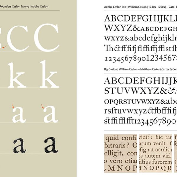
  with the materials. Was this direct connection between hands and brain, between execution and imagination, fundamentally different from the current connection of brain to keyboard? The physical act of tracing type, while tedious, had a side-benefit of “engraving” letterforms in memory. Traits like the crossed strokes of a Garamond capital W, or the straight descender of a Bembo italic lowercase y: these became tangible attributes once you’d traced them a few
  times. And, though this may be nostalgia speaking, the result was an intimate connection unlike more virtual ones gleaned from pixels on a screen. Matching a font to a particular text seems — in retrospect — to encourage a deeper relationship with the fonts than is afforded by our present restless search for novelty.
For as long as we still design for print, I think it will remain important to print out our layouts, cut them to the trim size, fold and tape them into spreads, and then hold the pages with the gutter curved as it will be in a bound book. Flat layouts, especially ones on a screen, don’t inform us about the physical demands on the page’s margins; it can be easy to misjudge type size, measure, and leading if we don’t experience the page as it will function in a completed book. This includes an awareness of how each specific project will be printed. Coated paper? Don’t choose a spindly, spiky typeface that will be brittle on the printed page. Elderly readers? In addition to sensitivity about type size, consider faces with a relatively tall ex-height and open counters.
Imagination.
In days before desktop equipment, a designer couldn’t physically mock-up every element in a manuscript; there wasn’t time to painstakingly trace out every combination of subheads, etc. Instead, the design process was built on a strong conceptual framework and then on trust: trust in the sensibility and skill of the tradesmen (they were virtually all male) who followed general specifications to set hot-metal type. We prepared traced layouts for the title page, contents page, a few chapter openers, a text spread with each level of subhead, an extract, and maybe list styles. When the compositor encountered (for example) a subhead stacking to a numbered list, he might extrapolate how much space to place between these elements based on other intervals in the design. It helped if there were long-term relationships between compositors and designers; each could then understand, predict, and build upon the sensibilities, the aesthetic intuition, of the other.
This process reminds me of trying to design for e-readers in our current environment. Just as the 1970s designer couldn’t physically lay out every possible permutation in a manuscript, we can’t foresee every e-book environment. Since we may not know exactly how each device will render  each typographic element, we may not be able to control every detail of how our design will be implemented. We have to build a strong conceptual framework for the material, and then imagine how the typographic elements might behave in different environments. We have to build hierarchies of emphasis—sometimes using relatively crude graphic distinctions. I once likened the process to designing with thick oven mitts on.
When thinking of e-pub, the uber-control of desktop layouts may well be maladaptive. Is it ironic that, forty years later, the physical constraints imposed by the relatively crude technology of the 1970s may have lessons for us in adapting our imaginations to the present challenging, ever-changing, electronic publishing environments?
I hope I’m around to see / hear/ learn how the design process and conscientious designers adapt in the decades ahead. As one of my favorite people used to say, “Onward through the fog!”
– – – – – – – – – – – – ——————————
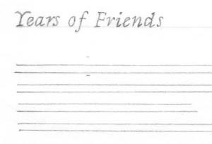 * For younger folk: in the days of hot-metal composition, designers drew out type pages and leading rules on the back of tracing paper, then flipped the paper over and traced out display type examples from type specimen books. The goals were to visualize one’s plans, and to present enough of the concept to guide craftsmen who might be executing the work hundreds of miles away. And only the telephone and the U.S. Postal Service bridged those miles.


