For the Artist within the Scientist
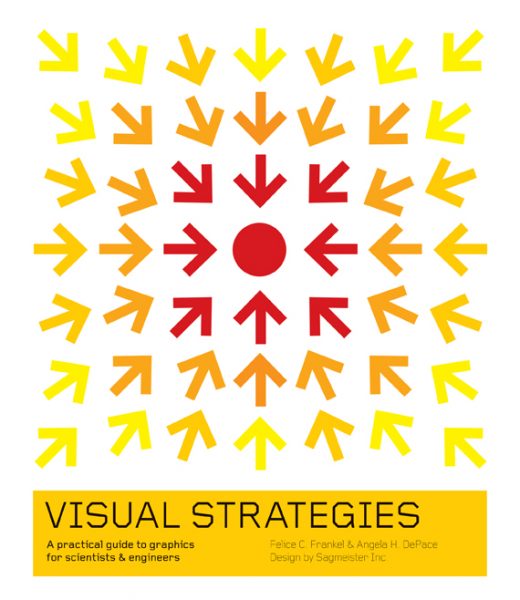
 When researchers communicate their findings, it’s not just the math and science that they should be concerned about—it’s also the art that counts. More specifically, the graphics that visually represent scientific data and concepts play a crucial role in clarifying or strengthening an argument, as Felice C. Frankel and Angela H. DePace explain in their book, Visual Strategies: A Practical Guide to Graphics for Scientists and Engineers. And it’s not only the readers who benefit from a series of well-thought-out graphics—scientists themselves have much to gain from the design process:
“The process of making a visual representation requires you to clarify your thinking and improve your ability to communicate with others. Furthermore, the process of making an effective graphic often leads to new insights into your work; when you make decisions about how to depict your data and underlying concepts, you must often clarify your basic assumptions.”
So what exactly does this mean for those in the scientific community, as they rack their brains over visuals that have to be designed for scientific journals, grant proposals, conference posters or presentations? In a video from the MIT News Office that we introduced earlier in November, Frankel presents us with a specific example, showing how the removal of color from a representation of a quantum corral can actually help to direct the reader’s attention to the most important aspects of the image:
[youtube=http://youtu.be/fAFjfacIvfU]
Or, instead of looking at scientific visuals that still have room for improvement, check out Frankel and DePace’s list of “visual classics” from the world of science. The Visual Strategies website introduces an unconventional series of artistic masterpieces, by the likes of Darwin, Escher and Hayward. Abstract concepts are made concrete; even aesthetically appealing.
With an even focus on both text and graphics, Visual Strategies is organized into concise chapters that help scientists determine the purpose of their visuals, explore case studies with “before” and “after” renderings, as well as discuss the growing importance of interactive graphics. For those who are curious to see if there is any art to be found in mitotic spindles, Venn diagrams and butterfly wing patterns, this book makes the perfect holiday gift for scientists, engineers, and anyone looking to sharpen effective communication and presentational skills.


